.svg)

On 8 October 2026, Anthropic opened two new features in Claude in beta. Claude Dashboards turns a question asked in plain English into a dashboard connected to your data. Claude Motion turns a report or a chart into a short animation, exportable as a video.
A single sentence is now enough to get a presentable dashboard, and every figure stays verifiable. 😍
At AI Sisters, we train teams to work with AI, tool by tool and role by role. Here is what Dashboards and Motion really do, who has access, and how to get your first reliable dashboard. Let's go 👇
In brief
- Launched in beta on 8 October 2026 by Anthropic, according to the official announcement and Reuters.
- Dashboards builds a dashboard from a question, by connecting to BigQuery, Snowflake, Databricks, Redshift, ClickHouse or Salesforce.
- Each chart shows its query and the time of its last update: you can check what is being counted.
- Motion animates your content with code, without generating video or people, and exports to MP4.
- Dashboards is open to all paid plans, Motion only to the Team and Enterprise plans.
- Docs, Slides and Design come out of beta and become available to everyone, including on the free plan.
What exactly is Claude Dashboards?
Claude Dashboards turns a business question into a dashboard connected to your data, with no formulas or code.
For example, you write "Show me this quarter's revenue by region". Claude finds the right tables in your data warehouse, writes a query for each chart, runs it, then puts it all together. According to Anthropic, the dashboard stays up to date when the data changes.
There are two ways to launch it, according to Anthropic's help page: by simply asking for it in a conversation, or by choosing "Output" then "Dashboards" below the input box. Dashboards are then stored in the Artifacts tab.

The difference from a chart requested from a standard chatbot comes down to two points. First, Claude queries your real data instead of working on a file pasted into the conversation. Second, every figure is linked to the query that produced it. You can open it, or ask Claude to explain it in plain English.
💡 To understand: the SQL query. It is the itemised receipt behind the total. The total tells you how much, the receipt tells you what: which products, which period, which discounts. If the total looks odd, you reread the receipt before blaming the till.
To go further, Anthropic plans to let you send a dashboard to specialist analytics tools: Amplitude, Grafana, Hex, Mixpanel, Omni, Perplexity, PostHog and Sigma. Looker, Tableau, monday.com and Databricks Genie are announced as "coming soon".
Claude Motion: animations written in code
Motion turns a report, a chart or a product demo into a short explainer video.
The key point, highlighted by both Anthropic and Blog du Modérateur: Motion does not use a video generation model. Claude writes the code that animates your text, your charts, shapes and the images you provide. So there is no filmed footage and no AI-generated person.

The practical upshot: you can correct a figure without regenerating everything. You ask Claude to replace "+12%" with "+11.8%", or you change it directly in the editor, and the rest of the animation stays identical. Export is to MP4. Anthropic also mentions connections to Adobe, Descript, HeyGen, Higgsfield, invideo, Luma AI and Runway, with Canva and Captions "coming soon".
💡 To understand: code rather than generated video. A generated video is a recording: to change one note, you have to replay the whole thing. A code animation is a score: you correct one bar, and the orchestra plays the rest exactly the same.
Who has access, and what remains unclear
Both tools are in beta, and they are not open to the same plans. Here is the situation as of 14 October 2026, according to Anthropic's help pages.
| Claude plan | Dashboards (beta) | Motion (beta) | Docs, Slides, Design |
|---|---|---|---|
| Free | No | No | Yes |
| Pro and Max | Yes | No | Yes |
| Team | Yes | Yes, on by default | Yes |
| Enterprise | Yes, to be turned on by an administrator | Yes, to be turned on by an administrator | Yes, on by default from 15 October |
On Enterprise, activation is done in the organisation settings, under Artifacts. Administrators can also restrict access to certain groups. No extra cost has been announced: both tools draw on your plan's usage quota, and a long or complex animation uses more of it than an ordinary message.
The announcement leaves several questions unanswered. We have gathered them here, because they are the ones your teams will ask.
| Question | What we know | Source |
|---|---|---|
| How often does the dashboard update? | Each chart shows the time of its last refresh. No frequency or guaranteed delay has been published | Anthropic help |
| How many dashboards or animations per month? | No figure: everything is deducted from the plan's quota | Anthropic help |
| Length and resolution of Motion videos? | Not specified. Anthropic's examples refer to 30-second explainers | Anthropic help |
| Sound, subtitles, layered export? | Not mentioned. Only MP4 export is documented | Anthropic help |
| Who can see my dashboard? | No one until you click "Share" | Anthropic help |
| Has the quality of the charts been measured? | No: no independent tests published to date, only Anthropic's demos | Press review as of 14 October |
⚠️ The real risk is not aesthetic. An elegant chart that counts the wrong rows is more dangerous than a plain Excel table, because people trust it. Anthropic says so itself in its help pages: if a chart does not count what you expected, open its query and tell Claude what to fix.
Discover our AI training & book a call
Teach your teams to query their data with Claude, and to check what it tells them.
📚 See our AI training📞 Book a discovery call
What it changes for three roles
Dashboards and Motion are aimed first at people who wait for a figure from a data team, then present it to others. Three examples, to adapt to your organisation.
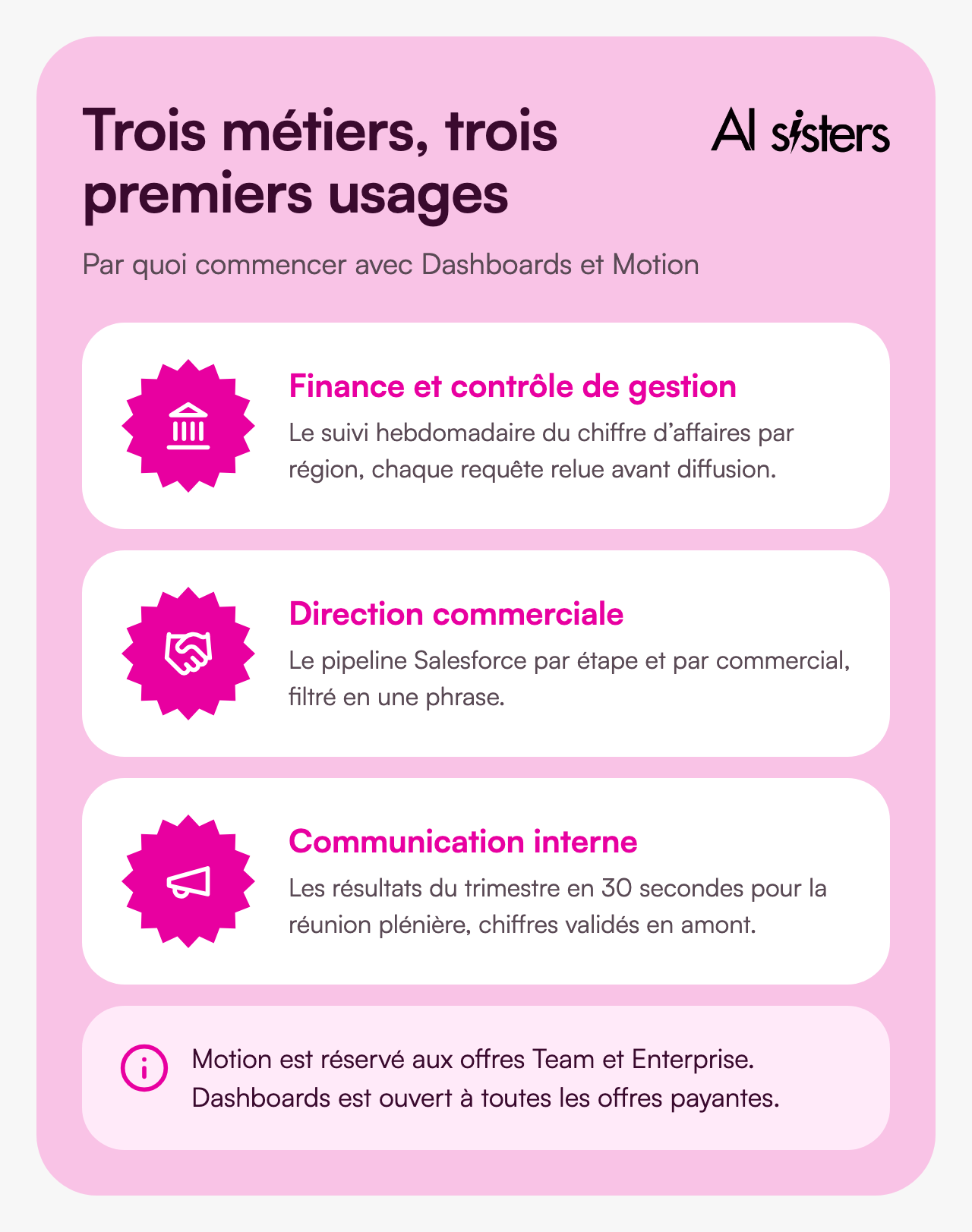
For finance and management control: recurring tracking, not the close.
Today, weekly reporting often involves an export, a spreadsheet and half a day of formatting. Dashboards produces the overview in one request, and adjusts it in conversation: "switch to a weekly view", "add a filter by country". First task to hand over: an indicator you know by heart, to check that Claude finds the same figure as you. Watch out for: a read-only connection account, limited to the tables you need.
For sales management: the pipeline without waiting for Monday's review.
Anthropic gives the example itself: "a dashboard of my open Salesforce opportunities, by stage and by sales rep". The sales director asks the question themselves, instead of passing it on to the sales operations team. First task to hand over: the breakdown of opportunities by stage, compared with the existing Salesforce report. Watch out for: Claude sees what your Salesforce permissions open up to it, no more and no less.
For internal communications and marketing: the figure that needs to stick.
The quarter's results often fit into three slides that nobody remembers. With Motion, a Team or Enterprise team can turn them into a 30-second animation for the all-hands meeting, based on the validated report. First task to hand over: an internal animation, never shared externally without review. Watch out for: Motion animates what it is given, so the figures must be validated before, not after.
Your first dashboard in a single prompt: the guide
A single prompt is enough to get started. The review, however, cannot be delegated. Here are five steps to go from a demo to a dashboard you will be confident sharing.
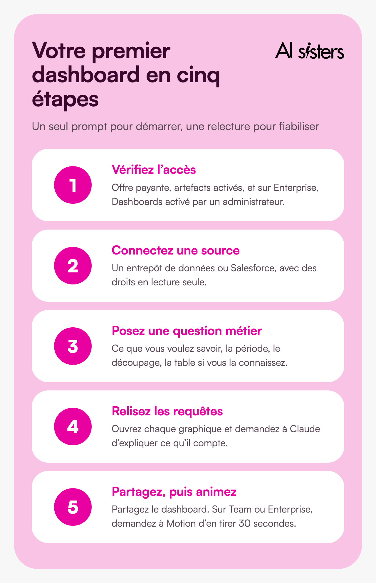
- Check access. You need a paid plan. On Enterprise, ask your administrator to turn on Dashboards, and Motion if needed, in the organisation settings.
- Connect a data source. BigQuery, Snowflake, Databricks, Redshift, ClickHouse, or an app already linked to Claude such as Salesforce. Ask your data team for read-only access.
- Ask a question, not a chart order. Anthropic advises saying what you want to know, and naming the table if you know it. Specify the period, the breakdown and the audience.
- Review each query. Open the charts one by one and ask: "Explain in plain English what this chart counts and what it excludes." Compare at least one figure with your usual reporting.
- Share, then animate. The dashboard stays private until you click "Share". On Team or Enterprise, then ask Motion to turn the three key figures into 30 seconds.
The starting prompt we recommend, to adapt:
"Build a dashboard of this quarter's revenue, by region and by week, from the sales table in BigQuery. It will be read by the leadership team: three indicators at the top, two charts below, and nothing else. For each chart, state what is excluded from the calculation."
Then, for Motion:
"From this dashboard, make a 30-second animation for Monday's all-hands meeting: total revenue, the fastest-growing region, and the trend over the last eight weeks. Understated tone, in the company colours."
These habits, setting a clear objective, framing the audience, checking the result, are what make the difference between a demo and everyday use. They are at the heart of our role-based approach to training.
Book your 30-minute call
A no-obligation conversation to build your AI roadmap.
👉 Tell us about your AI project 👈
Key takeaways
- Dashboards turns a question into a dashboard connected to your data, and shows the query behind every figure.
- Motion animates your content with code: no generated video, targeted corrections, MP4 export.
- Access differs: Dashboards on all paid plans, Motion on Team and Enterprise, all in beta.
- Several points remain unclear: update frequency, video length, quotas. No independent tests have been published yet.
- Good looks do not replace checking: review each query before sharing a figure.
Sources
- Anthropic, Build live dashboards and animate explainers with Claude, 8 October 2026.
- Anthropic, Get started with Claude Dashboards, accessed 14 October 2026.
- Anthropic, Get started with Claude Motion, accessed 14 October 2026.
- Reuters via Investing.com, Anthropic launches dashboard, animation tools for Claude, 8 October 2026.
- Blog du Modérateur, Claude can now generate dashboards and animations, 12 October 2026.
- TestingCatalog, Claude launches Dashboards and Motion in beta, 8 October 2026.




.avif)
